
Cognizant
Reimagining airline loyalty program
Discipline
UX Research, CX Design
Role
CX Designer
Timeline
Jan -Sept 2024
Tools
Figma, Miro, Usertesting.com
Team
Product Managers, Creative Directors, UI Designers
Summary
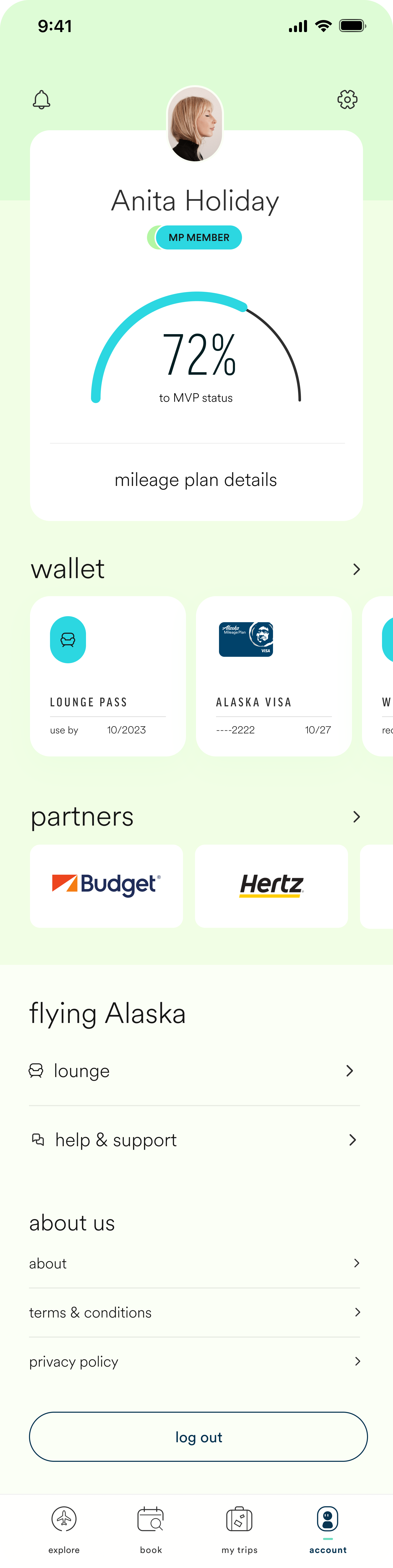
I worked on various core features within the yet-to-be-released updates on the Alaska Airlines app and website, mainly revolving around how the new loyalty program user experience would be like and pushing new ideas to Alaska Airlines to enhance customer experiences while promoting loyalty.
Throughout this walkthrough, you will see my thought process throughout the work and collaborations with the design team.
Quick Introduction
In the ever-so-competitive airline industry, the loyalty space has been the area for growth. It currently has a higher market value than the airline itself. We were tasked with revamping the design ecosystem while strengthening brand image and customer loyalty.

What Alaska told us
Travel loyalty programs have dramatically changed, and competitors have been keeping up with fully integrating your lifestyle beyond just butt in (airplane) seat.
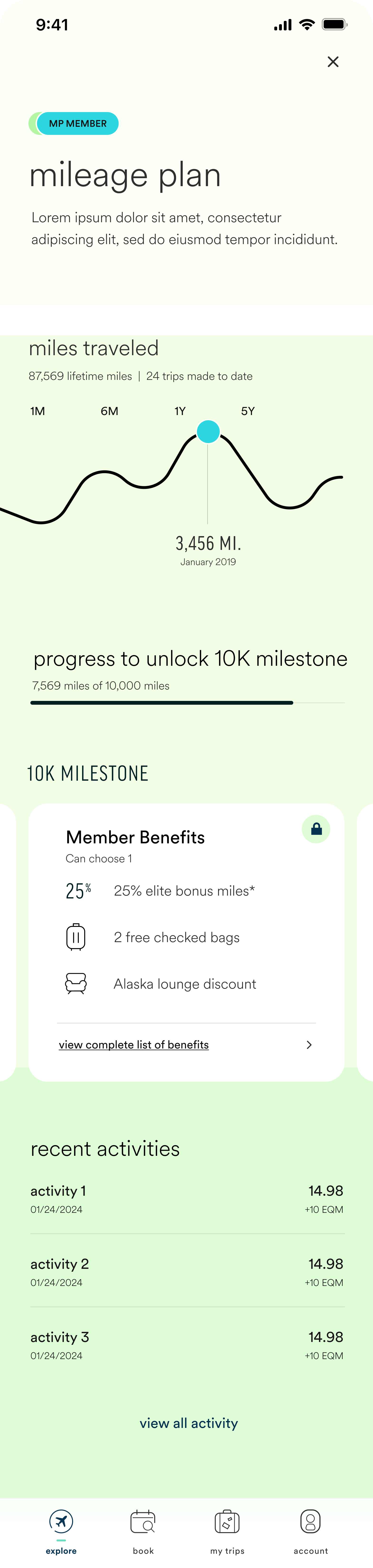
According to Alaska Airlines, milestone rewards are one way to emphasize on personalization, but what does it look like beyond the technical ancillary revenue, what is the new customer experience as rewards are constantly evolving?
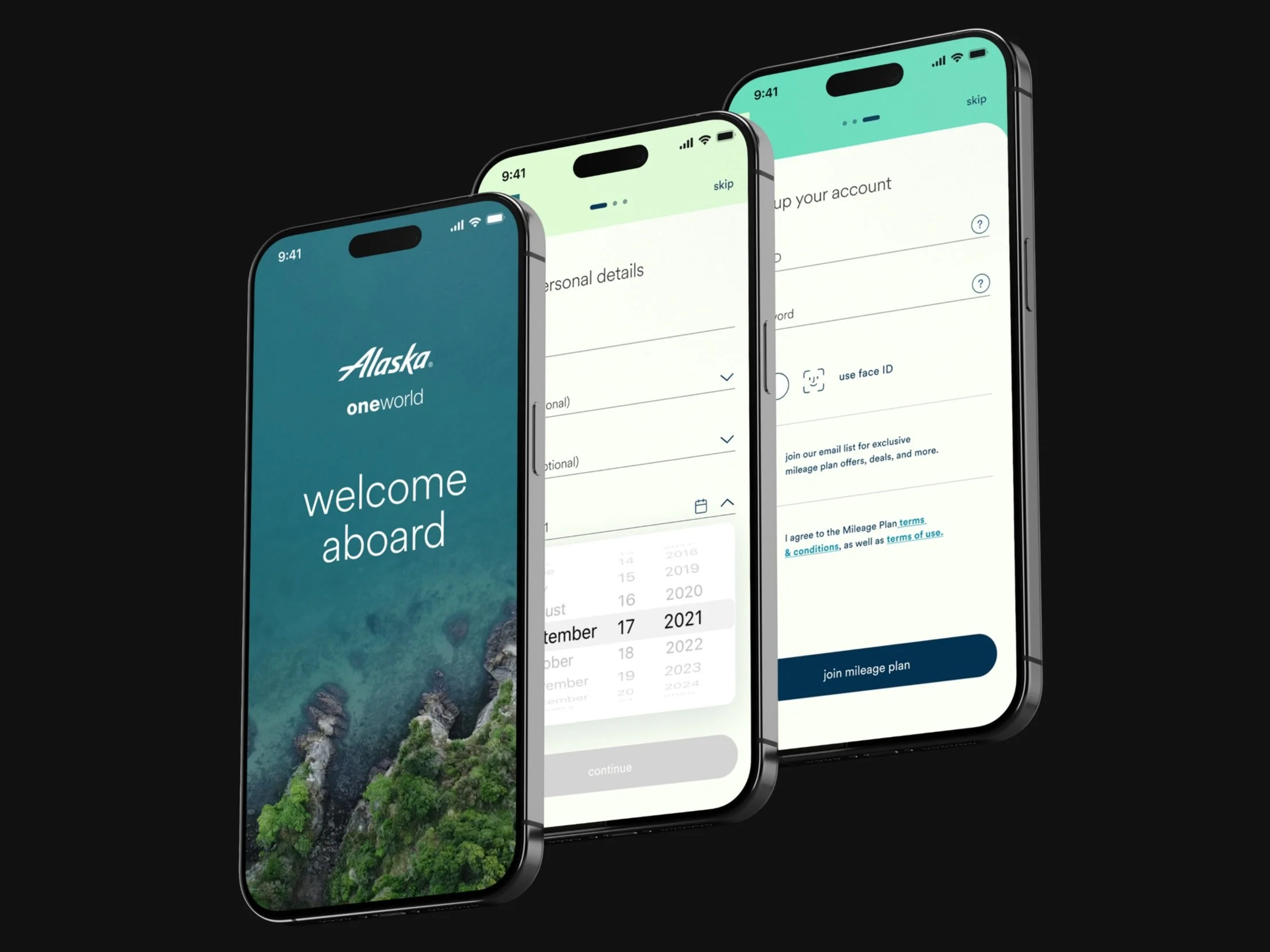
During the construction of the new milestone infographic, I had to chance to write the testing plan and execute series of task on Usertesting.com with actual Alaska Airlines customers.
Thus, the testing result provided valuable feedback for revision and gave us further insights on what worked and didn’t work.
Research Summary
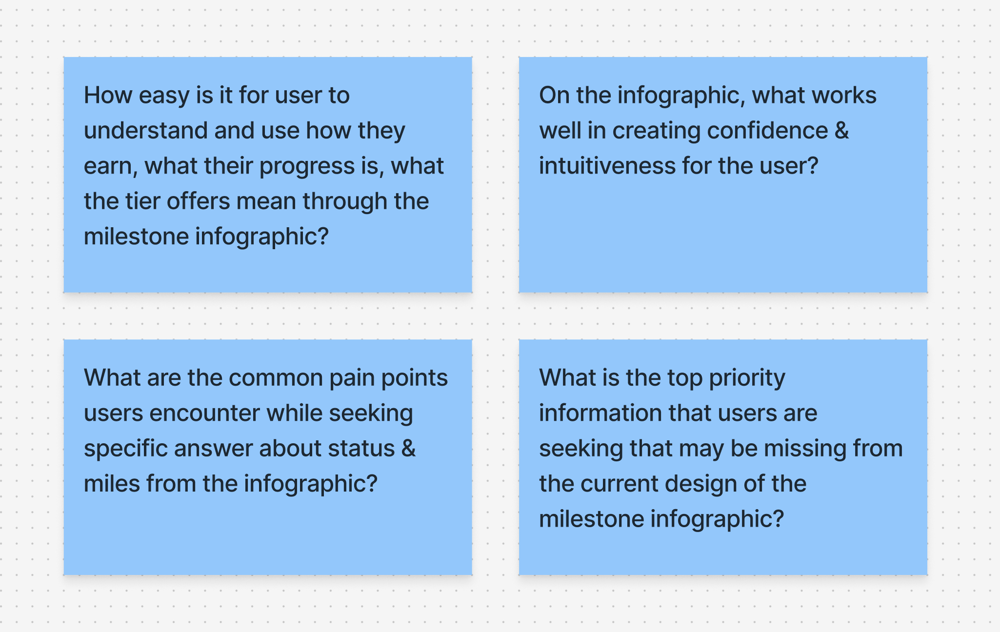
Questions we asked
Task completion rate
Error rate
CSAT
Ease of use
Metric we measured
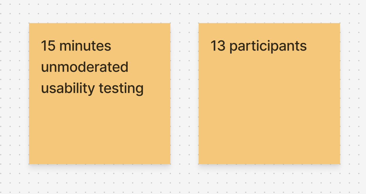
Method we used
Tasks we deployed
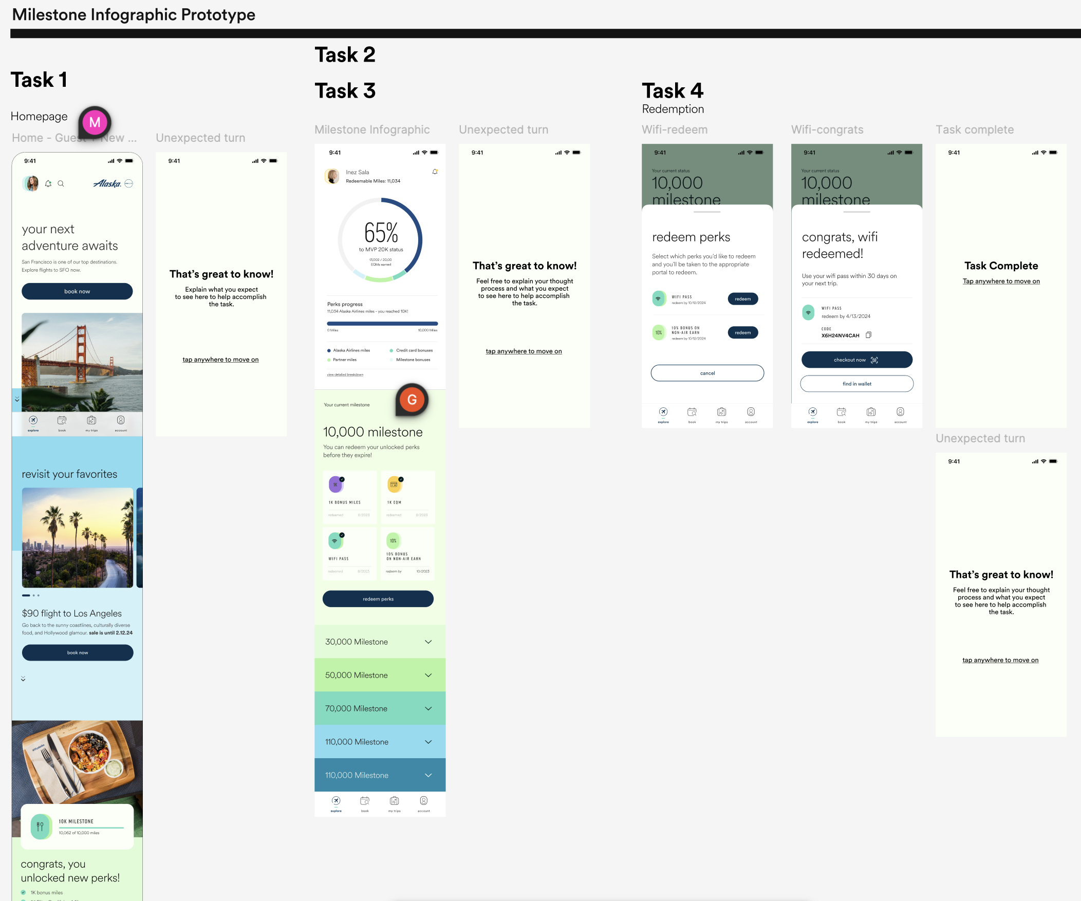
Testing prototypes
What we discovered
4.35/5
CSAT score on first impressions about the initial design of the milestone infographic.
4.54/5
CSAT score on likelihood of revisiting the infographic page.
5/13
of users would like to see more details on information about what counts towards their status.
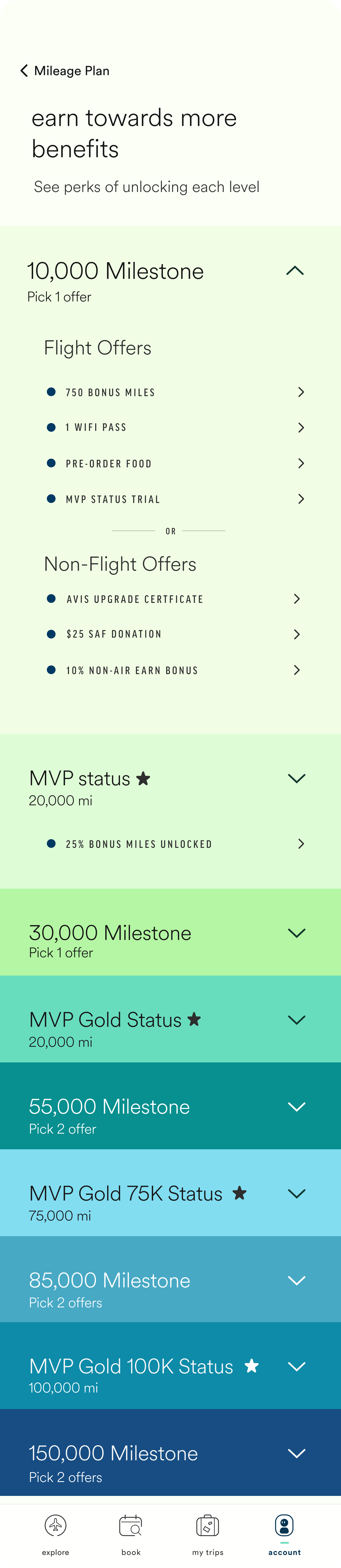
At this stage, elite perks and earnings were still in the planning stages from a business standpoint. To simplify the overall experience, we conducted another round of iterations to address the pain points we gathered from our user testing.
Emphasis on the visual treatment between automatically applied perks and manual redemption perks.
Improvement of the interaction of perk modules is needed to create a more intentional action.
How we solved
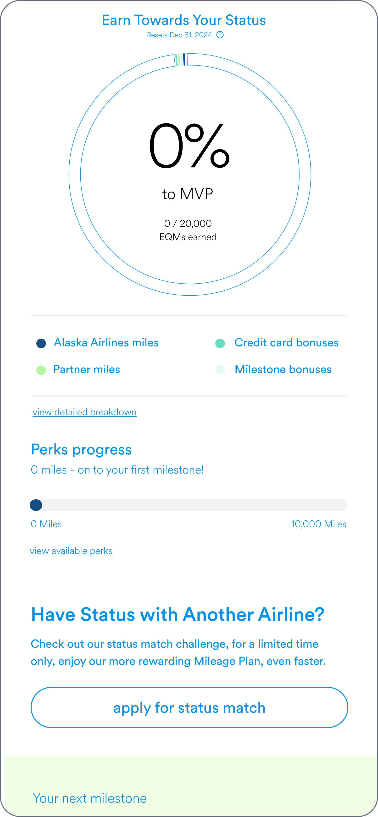
Revised Elite Journey
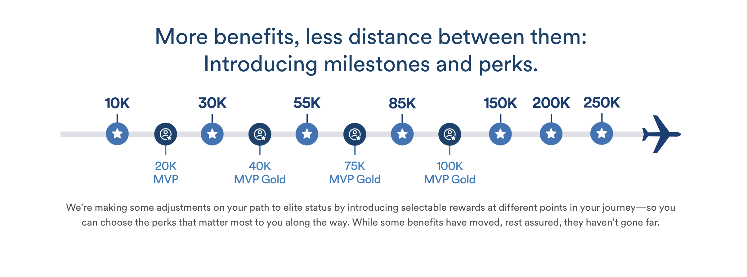
Despite many rounds of new information provided by the client. Our refined solution to the milestones and perk redemptions is to create an easy-to-read accordion style infographic featuring the benefits with progressive disclosure in mind.
When it comes time to redeem your perks, we went through rounds of wire-framing, critiques, and user testing with Alaska Airlines loyalty members on this new perk redemptions concept.
Wireframe
Final UI
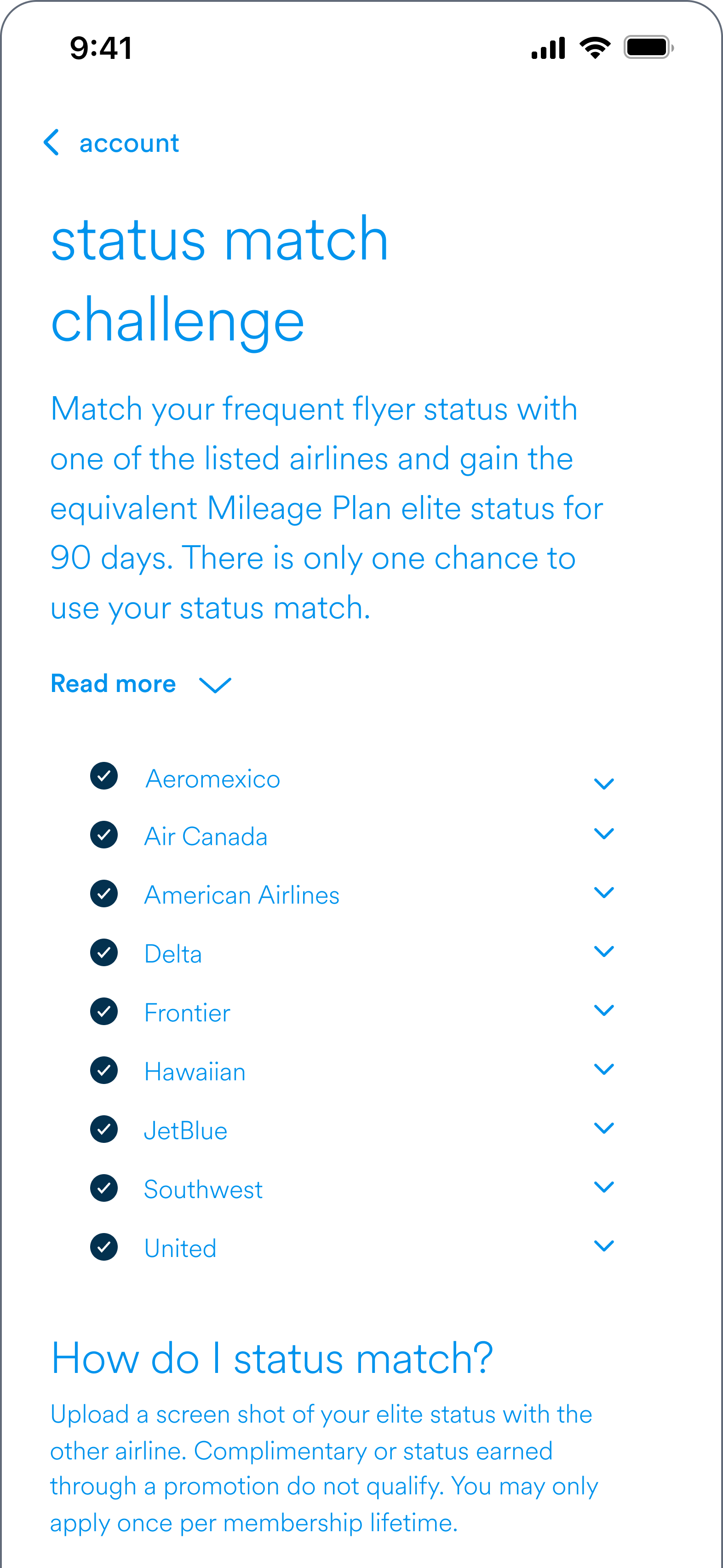
A key feature I introduced, which received great client feedback, was highlighting loyalty conversions. My research showed that most airlines with loyalty programs offer a status match, but broader program promotions often overshadow this feature.
With this statement from Alaska Airlines as a compass, "The most generous loyalty program is about to reward you with even more," we brought status match challenge to the forefront. These challenges give frequent travelers a taste of elite benefits, fostering trust and long-term loyalty.
Proposed Wireframes
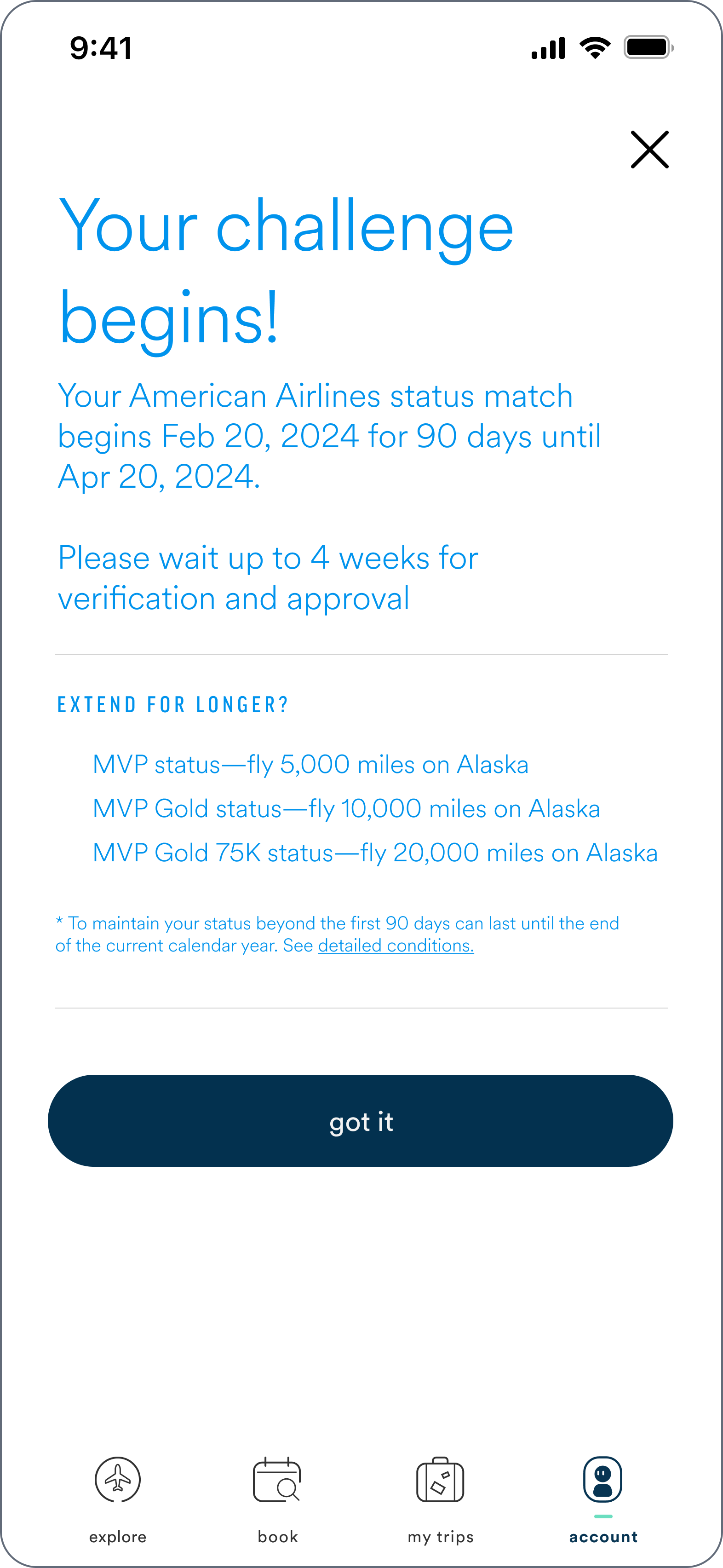

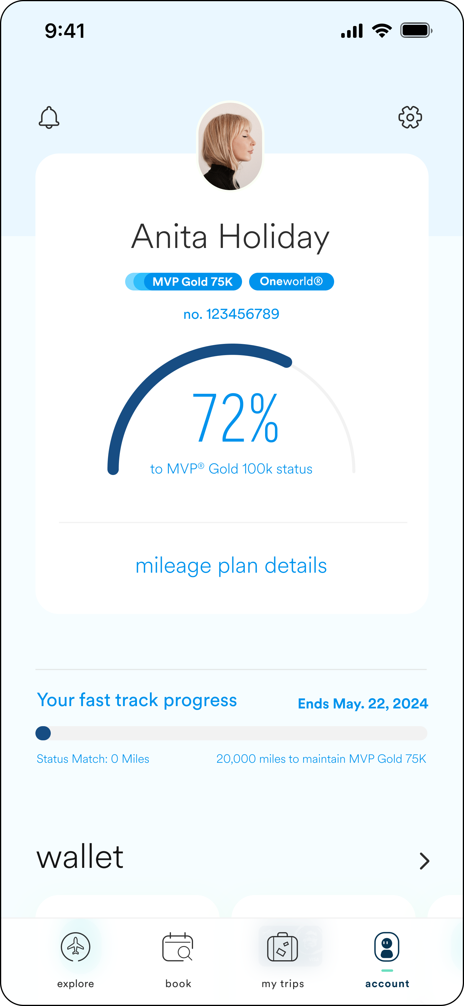
Once you start the status match, both reminders and indicators are embarking on your journey in the Alaska loyalty program, quick and seamlessly.
Challenges
Status match challenge can only be done by going to an external website. New users who hold status with another airline may not know about the status match.
Opportunities
Bringing the experience
in-app for redemption promos for greater visibility. Adding to the gamification element of status in account.
Well, what does it look like during your flight journey?
How do these new features enhance a traveler’s experience throughout their journey?
How might we support travelers from the start to the end of their trip?
Questions we asked ourselves
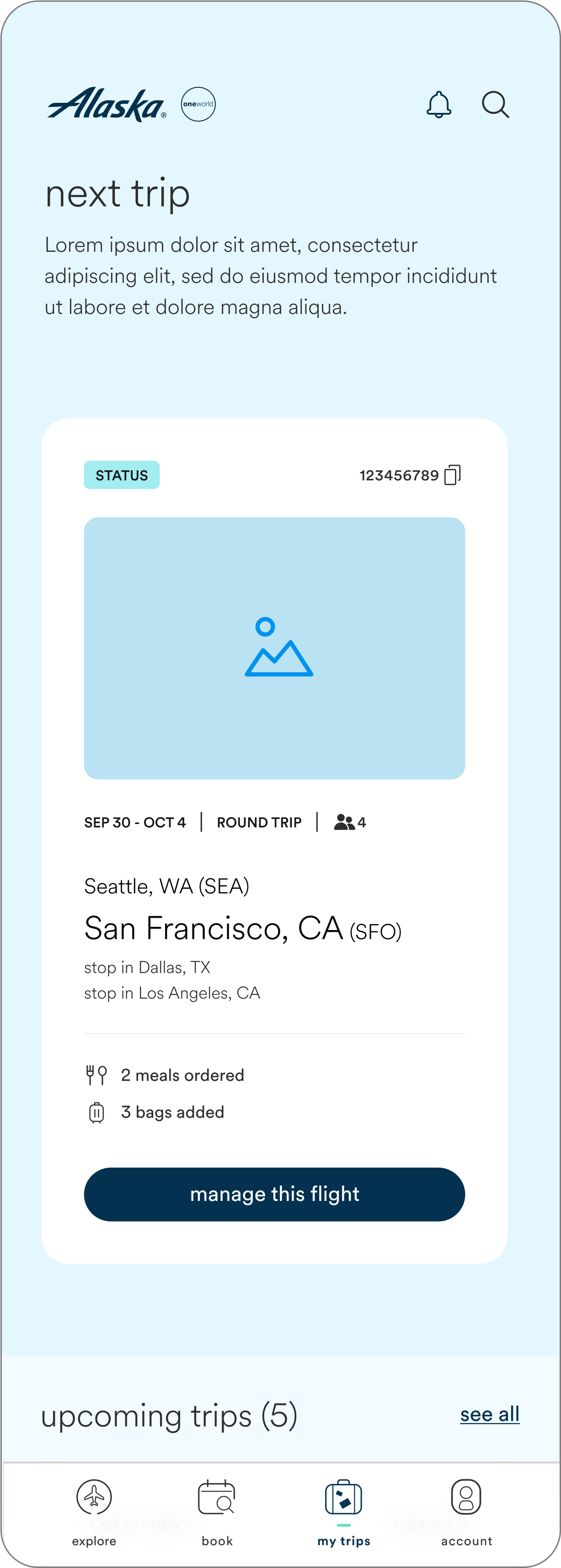
Current Trip Details page
How can we enable a truly self-service experience as guests manage their travel?
What priorities do guests have before check-in, during check-in, and on the day of travel?
How can we leverage the refreshed look to make the experience more inviting and visually compelling?
Where can we incorporate personalization into the Flight Card?
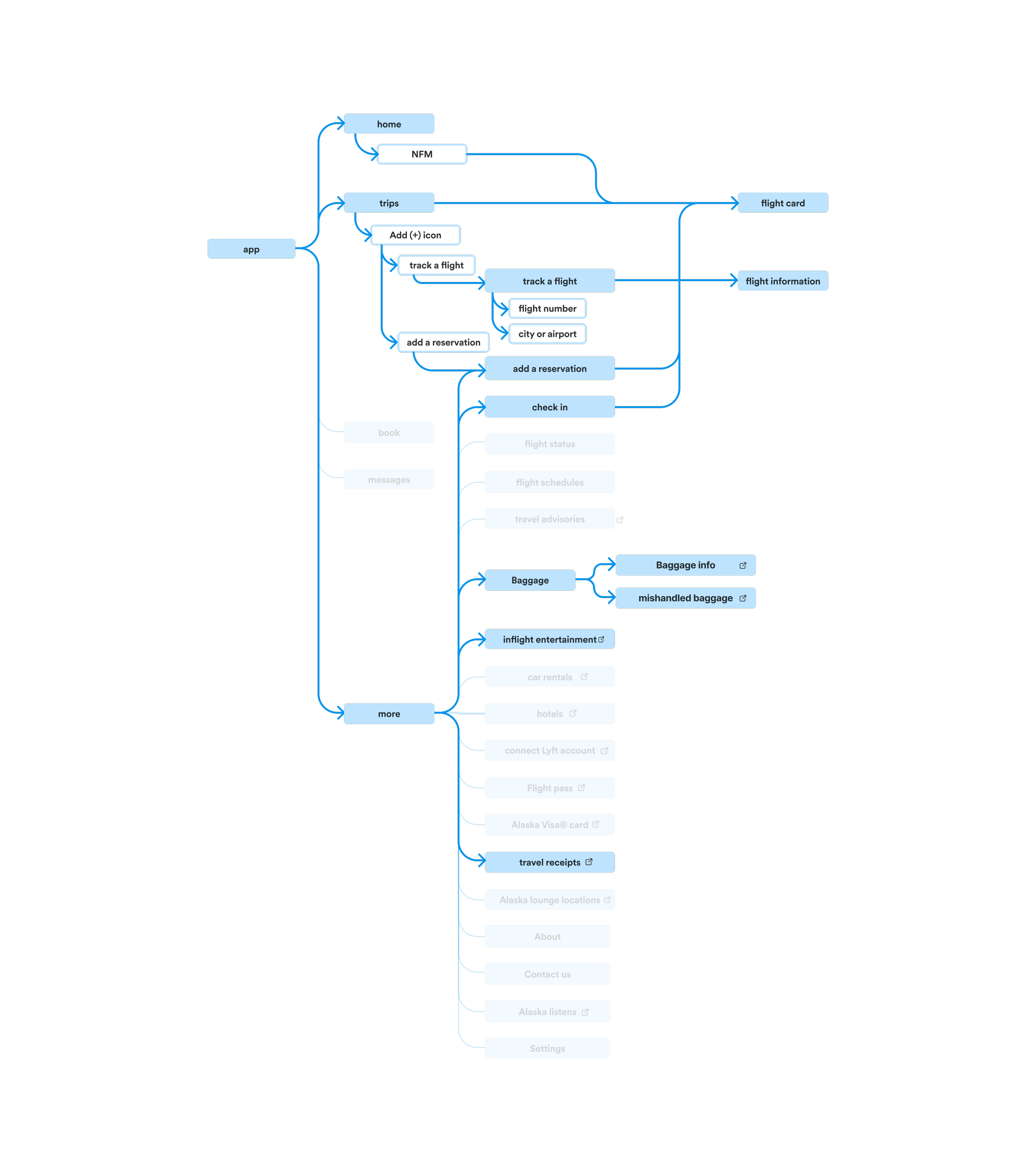
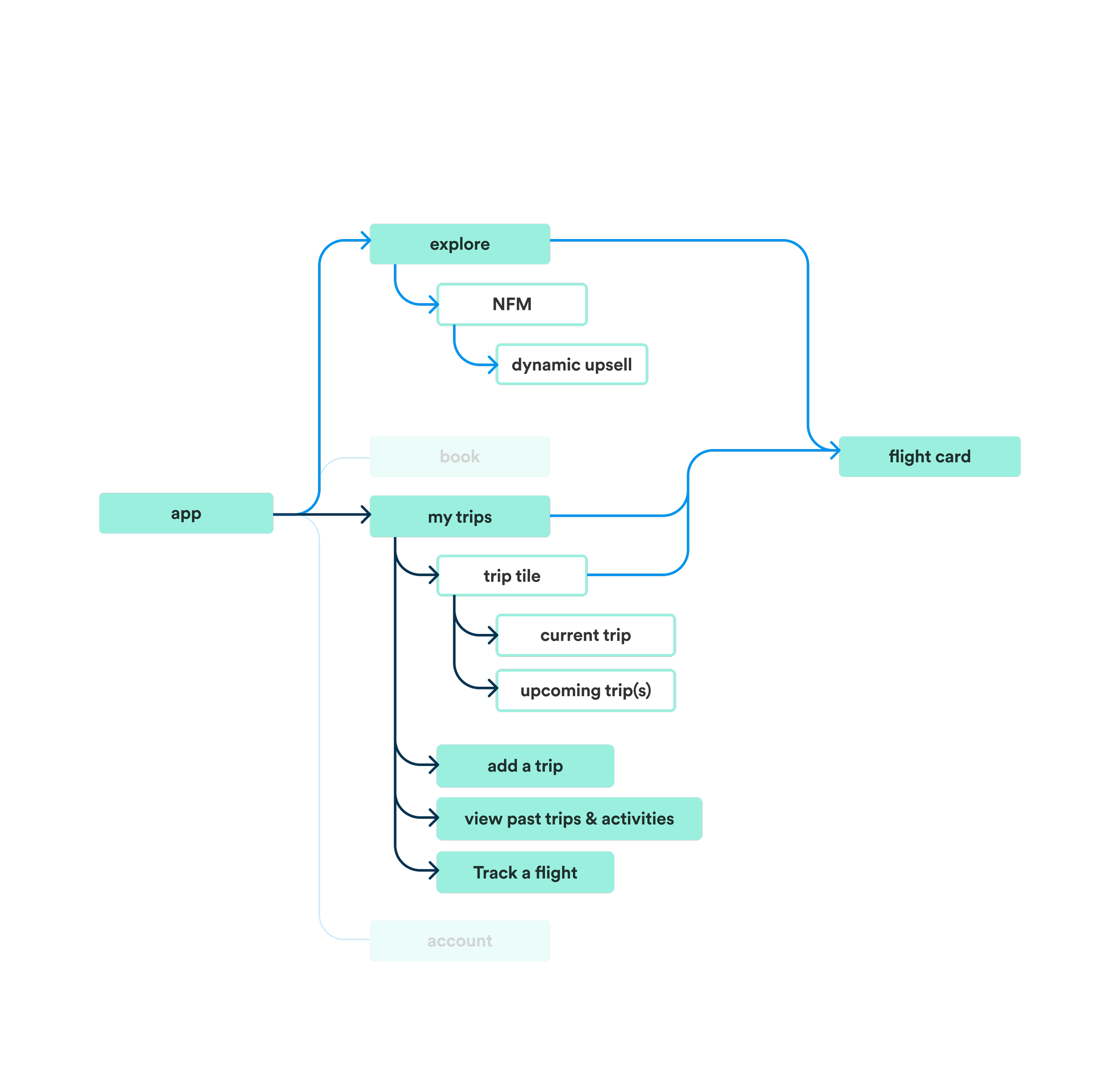
Information Architecture partial breakdown
By analyzing current and competitive information architecture and leveraging industry insights, we crafted a refreshed excursion to the information architecture.
I led the web version's main trip wireframe design while collaborating with three other designers on responsive UX designs for the whole app/web experience.
Before
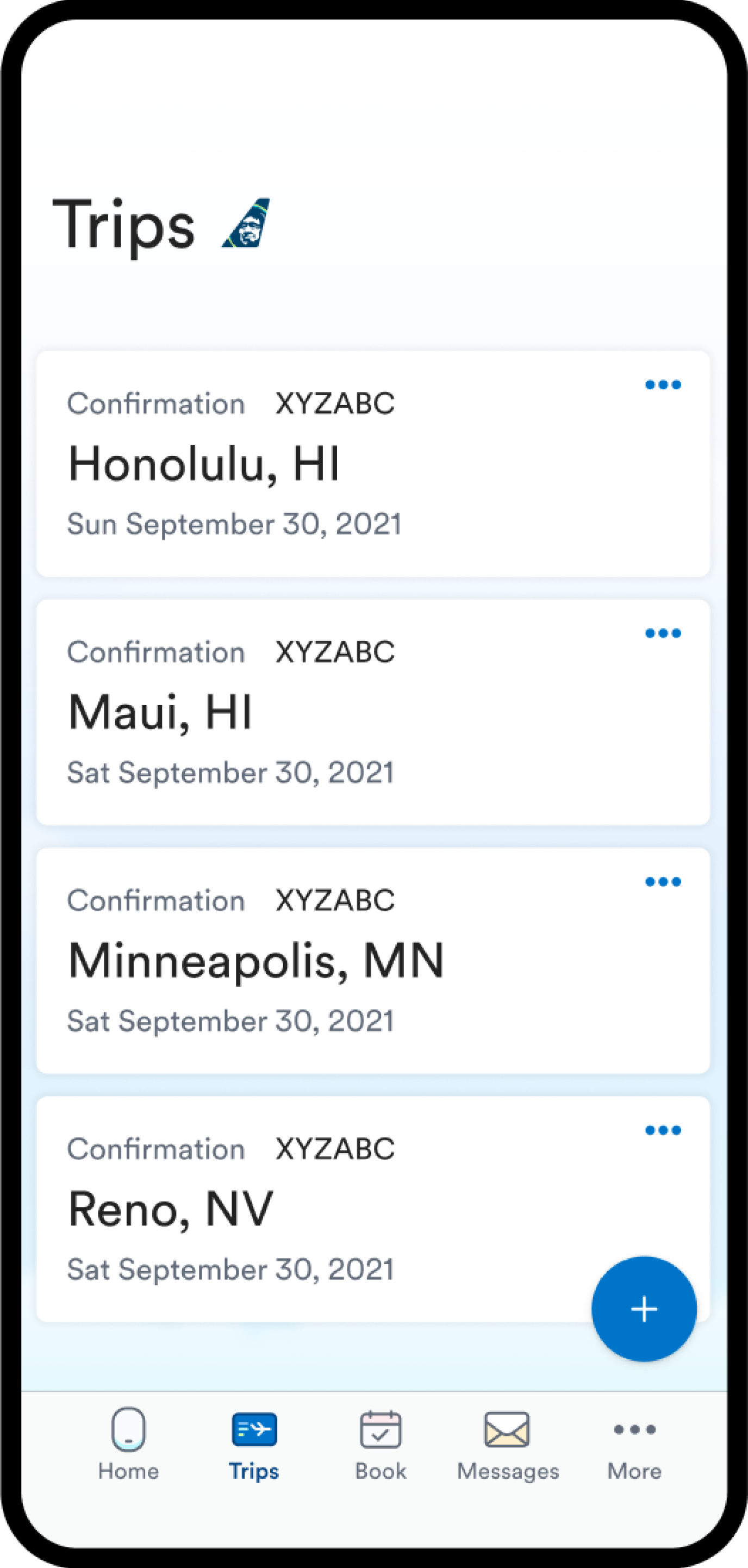
Before
After
After
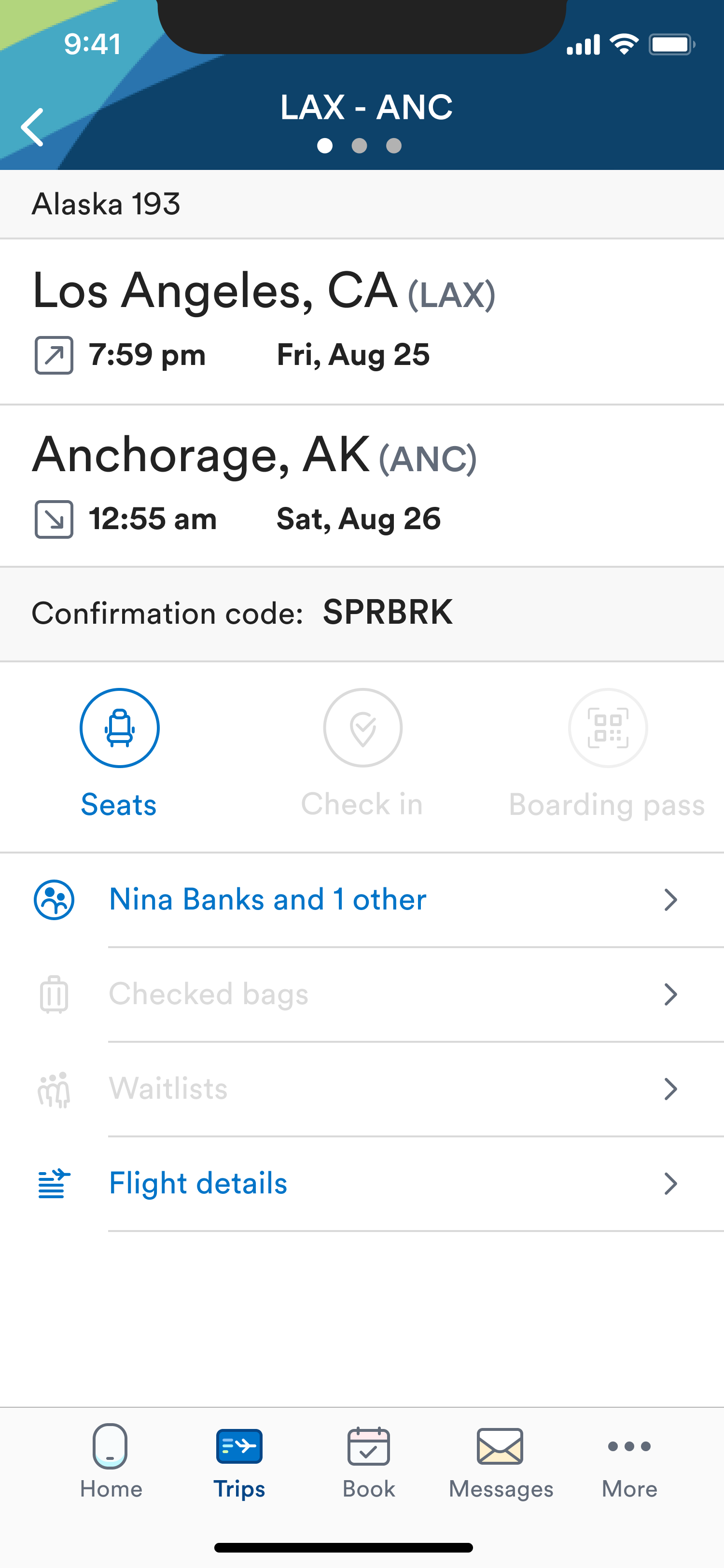
Starting from the trip cards, we wanted to serve as a directory for current and upcoming journeys, prioritizing the most relevant trip and providing the most useful information at the right time.
Flight Card is structured to present information from the most global to the most granular. Key actions, like check-in and accessing the boarding pass, are prominently placed at the top. Further down, guests can scroll to view and edit details for each passenger.
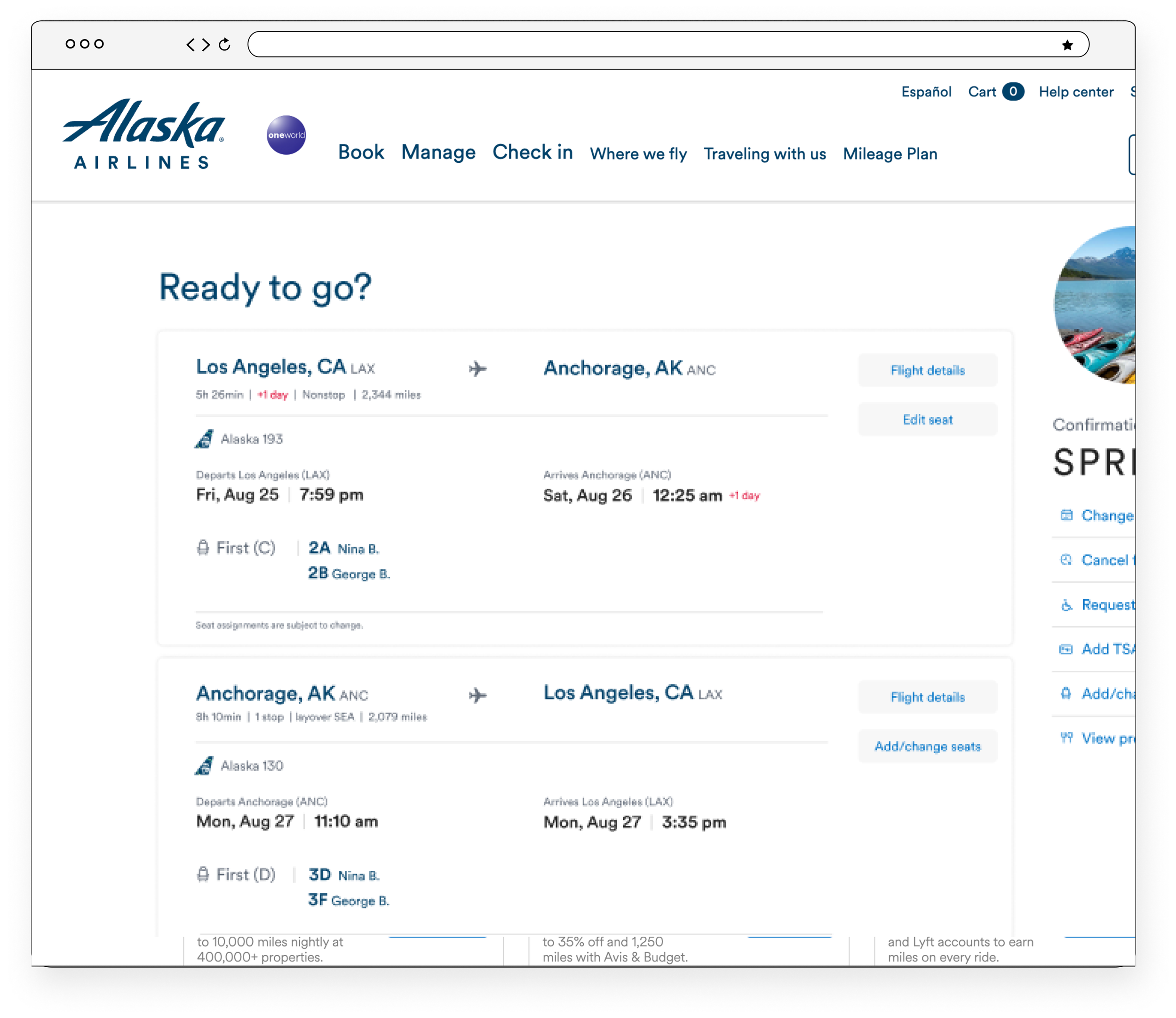
Main advantage of desktop is its ability to display important trip information at a quick glance. It serves as a familiar hub for checking in, viewing boarding details, and discovering opportunities to enhance the travel experience—all in one place.
Learnings
Stay curious
When I was first brought on to this project, I’d only heard of Alaska Airlines since I am based in Atlanta, where a particular airline dominates most routes in and out of the city. Freshly bit by the travel bug, I was interested in how loyalty programs come into play for consumers, and I learned so much about how user experiences have such close ties to loyalty programs.
I spearheaded new features and customer journeys through each design sprint, conducting comparative analyses with other major airlines. Identifying opportunities and sharing insights with the design team and clients was especially rewarding, as practicing giving and receiving constructive feedback created a more meaningful and iterative design process.
Working with ambiguity
In this project, working in a large design team environment provided me with opportunities to collaborate with diverse perspectives, address complex design requirements, and create impactful user experiences. I learned the value of taking ownership of your work and taking on new challenges every day, even if results are not perfect on the first-try. Although our first instinct might be to feel discouraged, keeping an open mind is vital, especially when dealing with ambiguity.